e360 Sport
Roles
- Brand Strategy
- Branding
- Design
Details
e360 Sport
Oct 12, 2025
Energy From Every Angle
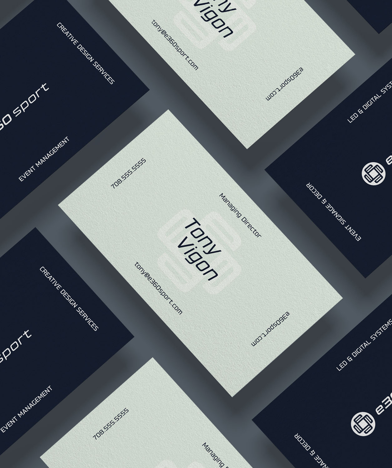
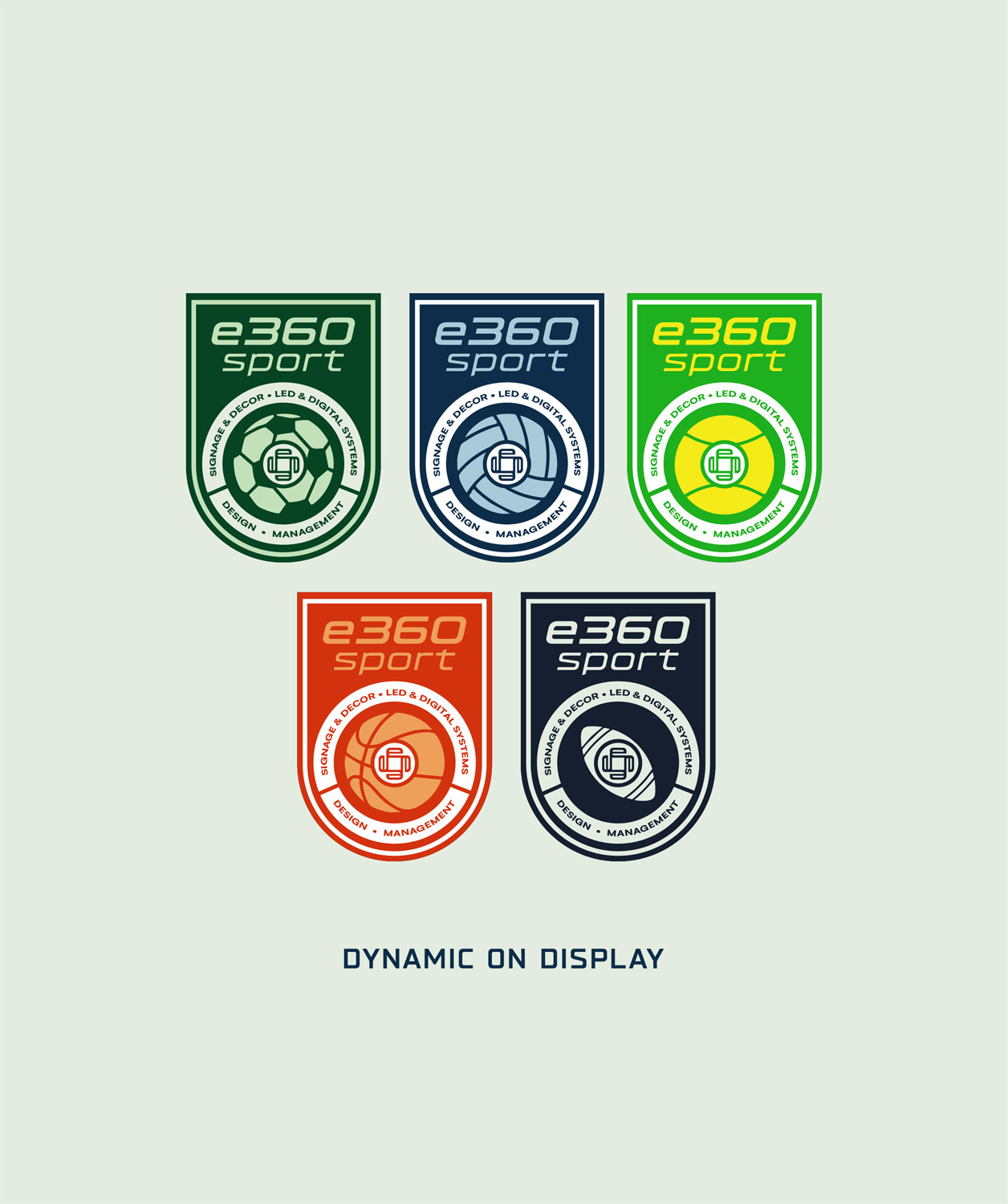
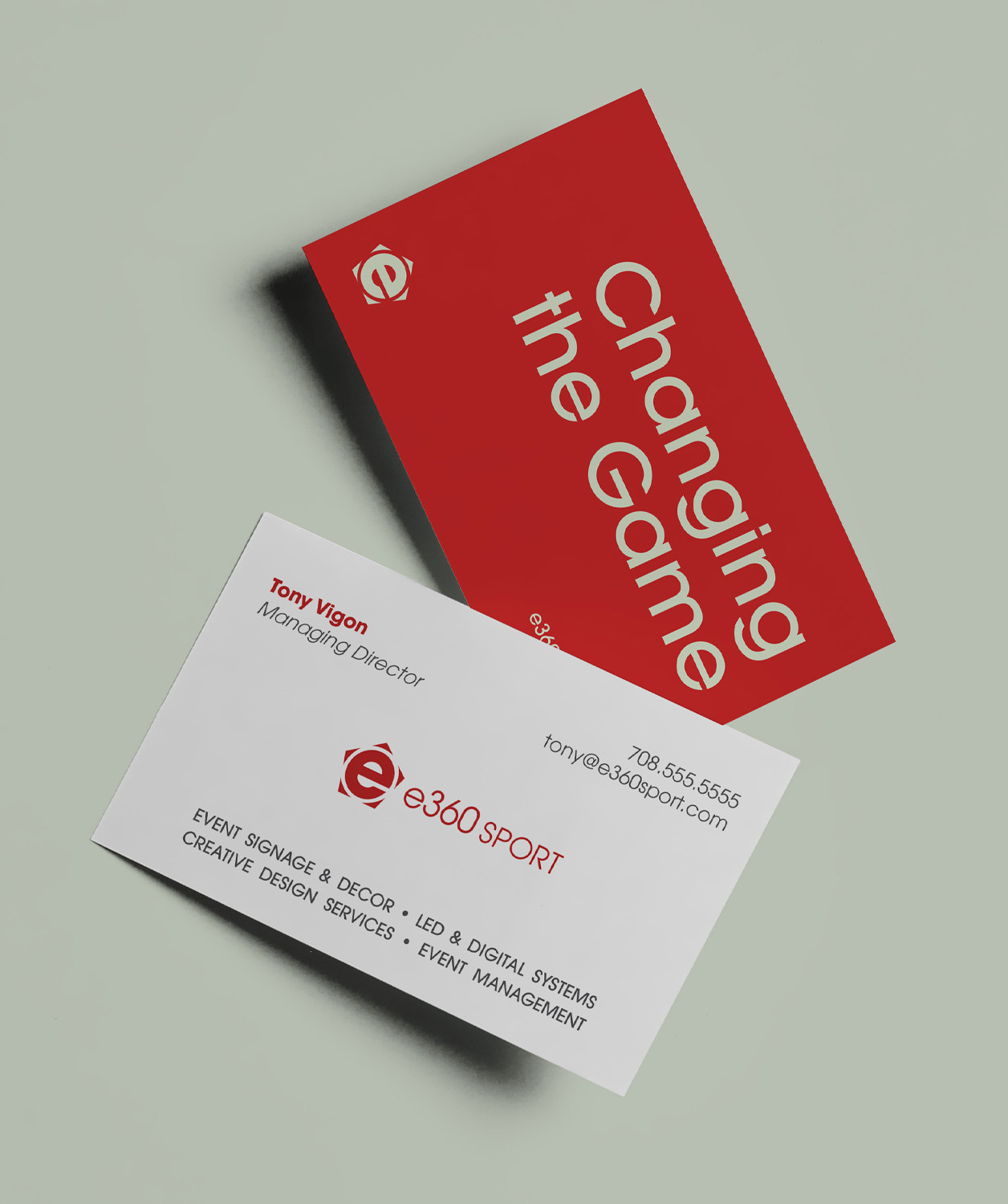
e360 Sport supplies LED digital displays and creates graphics for sports arenas and live-event venues. We developed two conceptual logo directions that capture the brand’s core: motion, energy, and connection. The first uses a bold, italicized typeface to reflect forward movement and the intensity of game-day environments.
A Second Perspective
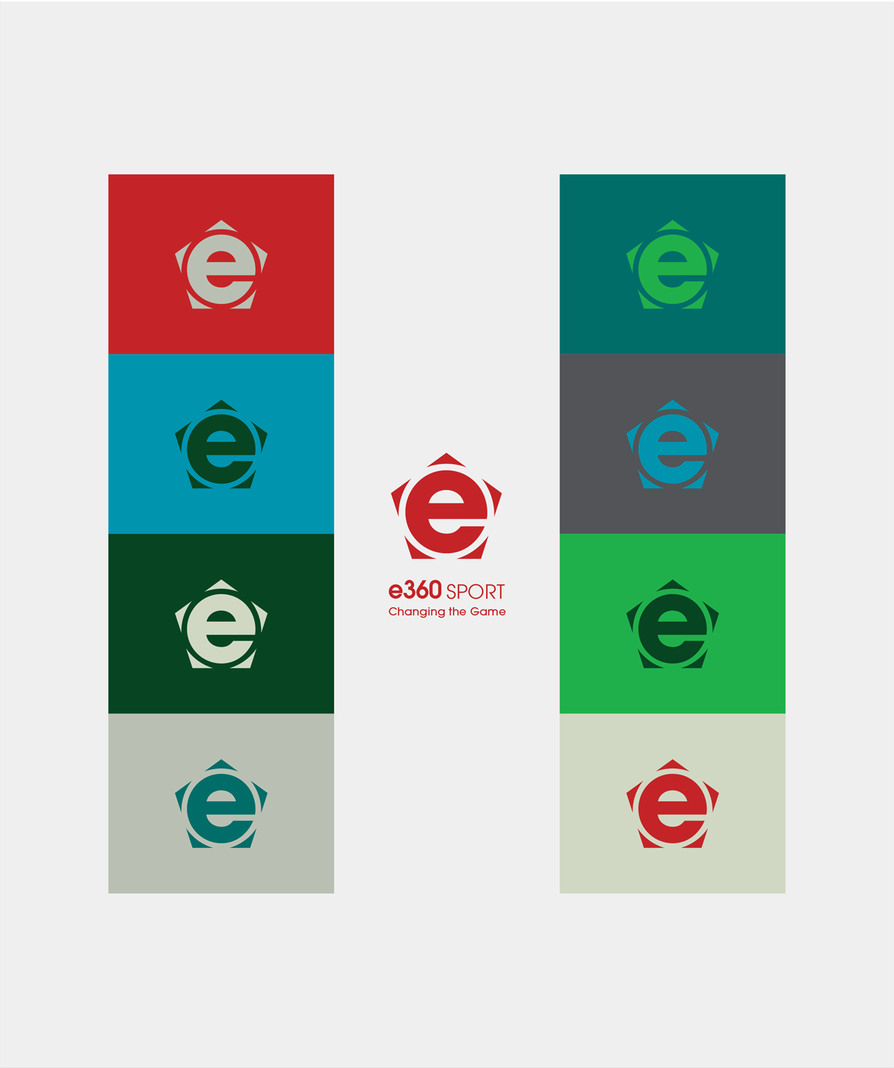
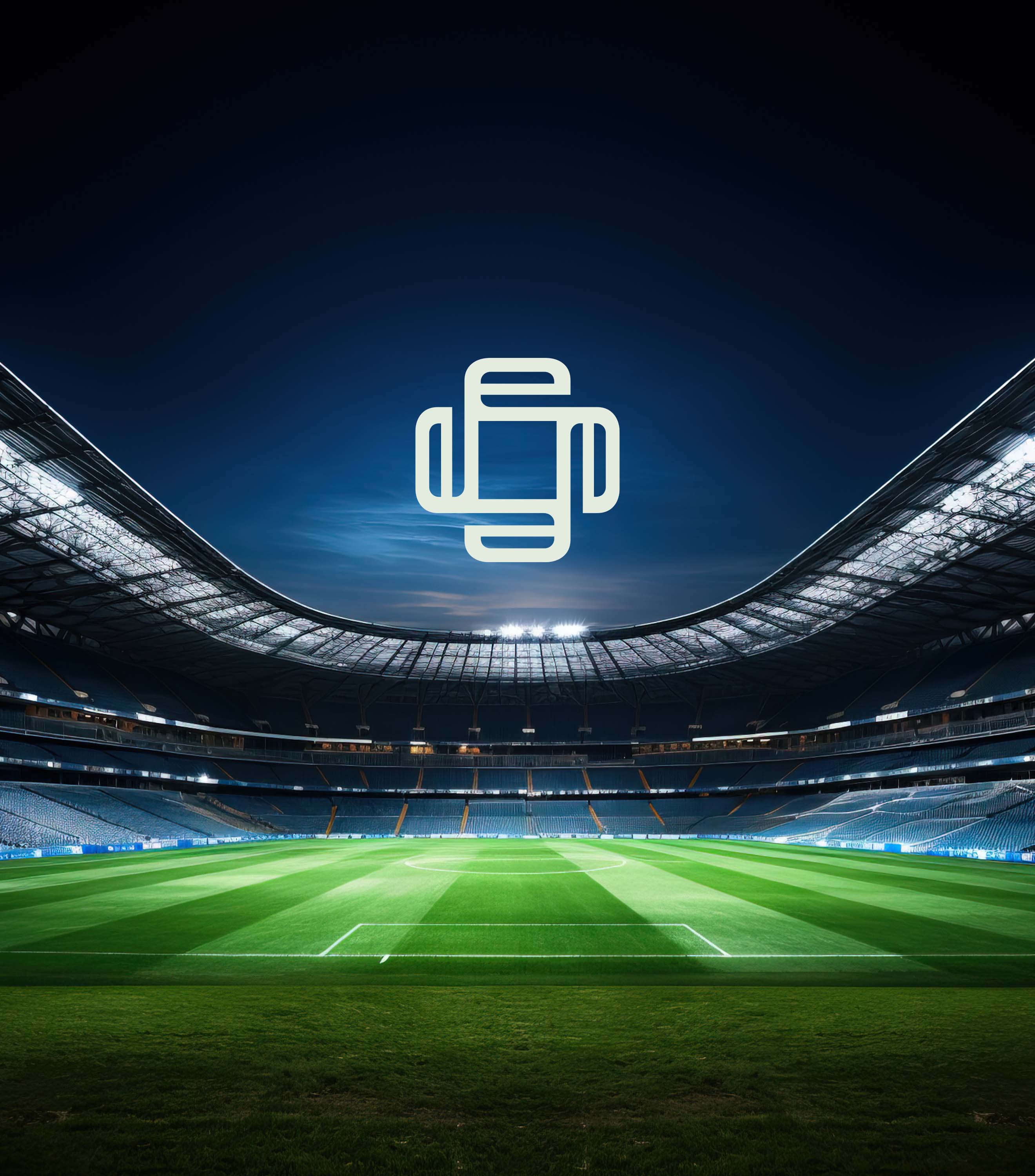
The second concept features a stylized “e” formed by subtle arrows radiating outward in 360 degrees - inspired by the geometric pattern of a soccer ball pentagon. It suggests precision, technology, and the immersive experience of viewing from every angle. Together, the two directions explore how e360’s identity can express dynamic visual engagement across major venues and sporting events.